
线性布局容器(Row、Column)
线性容器类表示按照水平方向或者竖直方向排列子组件的容器,ArkUI开发框架通过 Row 和 Colum 来实现线性布局。
主轴和纵轴概念
什么是主轴和纵轴?对于线性容器来说,有主轴和纵轴之分,如果布局是沿水平方向,那么主轴就指水平方向,而纵轴就是垂直方向;如果布局是沿垂直方向,那么主轴就是指垂直方向,而纵轴就是水平方向。
Row
Row 按照水平方向布局子组件,主轴为水平方向,纵轴为竖直方向。
Row定义介绍
interface RowInterface {
  (value?: { space?: string | number }): RowAttribute;
}- value:可选参数,
space表示设置Row的子组件在水平方向上的间距,简单样例如下所示:
    Row() {
      Text()
        .width(90)
        .height('100%')
        .backgroundColor("#aabbcc")
      Text()                        // 模拟子组件之间的间隔为20
        .width(20)
        .height('100%')
      Text()
        .width(20)
        .height('100%')
        .layoutWeight(1)
        .backgroundColor("#ccaabb")
    }
    .width('100%')
    .height(60)

    Row({space: 20}) {              // 设置子组件之间的间隔为20
      Text()
        .width(90)
        .height('100%')
        .backgroundColor("#aabbcc")
      Text()
        .width(20)
        .height('100%')
        .layoutWeight(1)
        .backgroundColor("#ccaabb")
    }
    .margin({top: 10})
    .width('100%')
    .height(60)
样例运行结果如5_1所示:

Row属性介绍
declare class RowAttribute extends CommonMethod {
  alignItems(value: VerticalAlign): RowAttribute;
  justifyContent(value: FlexAlign): RowAttribute;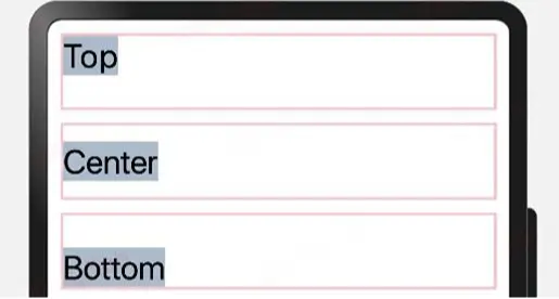
}- alignItems:参数类型为
VerticalAlign,表示子组件在竖直方向上的布局方式,VerticalAlign定义了以下三种对其方式:- Top:设置子组件在竖直方向上居顶部对齐。
- Center(默认值):设置子组件在竖直方向上居中对其。
- Bottom:设置子组件在竖直方向上居底部对齐。
简单样例如下所示:
    Row() {
      Text("Top")
        .fontSize(26)
        .backgroundColor("#aabbcc")
    }
    .alignItems(VerticalAlign.Top)    // 设置子组件在竖直方向顶部对齐
    .borderWidth(2)
    .borderColor(Color.Pink)
    .width('100%')
    .height(60)

    Row() {
      Text("Center")
        .fontSize(26)
        .backgroundColor("#aabbcc")
    }
    .alignItems(VerticalAlign.Center) // 设置子组件在竖直方向居中对齐
    .borderWidth(2)
    .borderColor(Color.Pink)
    .width('100%')
    .height(60)

    Row() {
      Text("Bottom")
        .fontSize(26)
        .backgroundColor("#aabbcc")
    }
    .alignItems(VerticalAlign.Bottom) // 设置子组件在竖直方向底部对齐
    .borderWidth(2)
    .borderColor(Color.Pink)
    .width('100%')
    .height(60)
样例运行结果如下图所示:
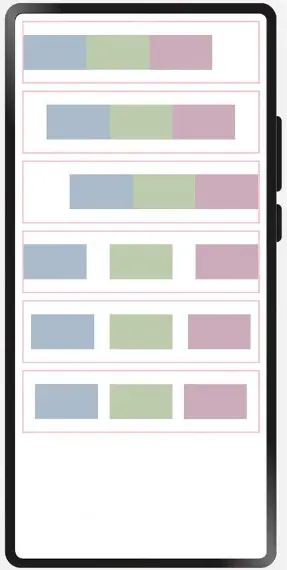
- justifyContent:设置子组件在水平方向上的对齐方式,
FlexAlign定义了一下几种类型:- Start:元素在主轴方向首端对齐, 第一个元素与行首对齐,同时后续的元素与前一个对齐。
- Center:元素在主轴方向中心对齐,第一个元素与行首的距离与最后一个元素与行尾距离相同。
- End:元素在主轴方向尾部对齐, 最后一个元素与行尾对齐,其他元素与后一个对齐。
- SpaceBetween:主轴方向均匀分配弹性元素,相邻元素之间距离相同。 第一个元素与行首对齐,最后一个元素与行尾对齐。
- SpaceAround:主轴方向均匀分配弹性元素,相邻元素之间距离相同。 第一个元素到行首的距离和最后一个元素到行尾的距离时相邻元素之间距离的一半。
- SpaceEvenly:主轴方向元素等间距布局, 相邻元素之间的间距、第一个元素与行首的间距、最后一个元素到行尾的间距都完全一样。
简单样例如下所示:
    @Entry @Component struct RowTest {

      build() {
        Column({space: 10}) {
          Row() {
            Text()
              .size({width: 90, height: 50})
              .backgroundColor('#aabbcc')
            Text()
              .size({width: 90, height: 50})
              .backgroundColor('#bbccaa')
            Text()
              .size({width: 90, height: 50})
              .backgroundColor('#ccaabb')
          }
          .justifyContent(FlexAlign.Start)
          .size({width: "100%", height: 90})
          .borderWidth(2)
          .borderColor(Color.Pink)
          Row() {
            Text()
              .size({width: 90, height: 50})
              .backgroundColor('#aabbcc')
            Text()
              .size({width: 90, height: 50})
              .backgroundColor('#bbccaa')
            Text()
              .size({width: 90, height: 50})
              .backgroundColor('#ccaabb')
          }
          .justifyContent(FlexAlign.Center)
          .size({width: "100%", height: 90})
          .borderWidth(2)
          .borderColor(Color.Pink)
          Row() {
            Text()
              .size({width: 90, height: 50})
              .backgroundColor('#aabbcc')
            Text()
              .size({width: 90, height: 50})
              .backgroundColor('#bbccaa')
            Text()
              .size({width: 90, height: 50})
              .backgroundColor('#ccaabb')
          }
          .justifyContent(FlexAlign.End)
          .size({width: "100%", height: 90})
          .borderWidth(2)
          .borderColor(Color.Pink)
          Row() {
            Text()
              .size({width: 90, height: 50})
              .backgroundColor('#aabbcc')
            Text()
              .size({width: 90, height: 50})
              .backgroundColor('#bbccaa')
            Text()
              .size({width: 90, height: 50})
              .backgroundColor('#ccaabb')
          }
          .justifyContent(FlexAlign.SpaceBetween)
          .size({width: "100%", height: 90})
          .borderWidth(2)
          .borderColor(Color.Pink)
          Row() {
            Text()
              .size({width: 90, height: 50})
              .backgroundColor('#aabbcc')
            Text()
              .size({width: 90, height: 50})
              .backgroundColor('#bbccaa')
            Text()
              .size({width: 90, height: 50})
              .backgroundColor('#ccaabb')
          }
          .justifyContent(FlexAlign.SpaceAround)
          .size({width: "100%", height: 90})
          .borderWidth(2)
          .borderColor(Color.Pink)
          Row() {
            Text()
              .size({width: 90, height: 50})
              .backgroundColor('#aabbcc')
            Text()
              .size({width: 90, height: 50})
              .backgroundColor('#bbccaa')
            Text()
              .size({width: 90, height: 50})
              .backgroundColor('#ccaabb')
          }
          .justifyContent(FlexAlign.SpaceEvenly)
          .size({width: "100%", height: 90})
          .borderWidth(2)
          .borderColor(Color.Pink)
        }
        .padding(10)
        .size({width: "100%", height: '100%'})
      }
    }
样例运行结果如下图所示:
如果 Row 设置了 space 参数,则 justifyContent 参数不起作用。
Column
Column 按照竖直方向布局子组件,主轴为竖直方向,纵轴为水平方向。
Column定义介绍
interface ColumnInterface {
  (value?: { space?: string | number }): ColumnAttribute;
}- value:可选参数,
space表示设置Column的子组件在竖直方向上的间距,参数和Row一样,读者可类比Row来理解,具体用法就不再介绍了。
Column属性介绍
declare class ColumnAttribute extends CommonMethod {
  alignItems(value: HorizontalAlign): ColumnAttribute;
  justifyContent(value: FlexAlign): ColumnAttribute;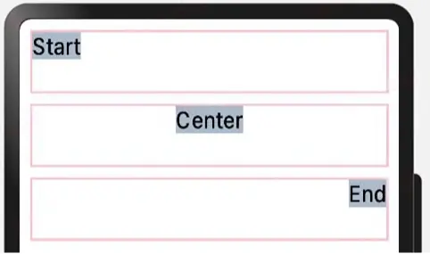
}- alignItems:设置子组件在水平方向上的布局方式,
HorizontalAlign定义了以下三种对其方式: - Start:设置子组件在水平方向上按照语言方向起始端对齐。
- Center(默认值):设置子组件在水平方向上居左对齐。
- End:设置子组件在水平方向上按照语言方向末端对齐。
简单样例如下图所示:
    Column() {
      Text("Start")
        .fontSize(22)
        .backgroundColor('#aabbcc')
    }
    .alignItems(HorizontalAlign.Start)
    .size({width: "100%", height: 60})
    .borderWidth(2)
    .borderColor(Color.Pink)

    Column() {
      Text("Center")
        .fontSize(22)
        .backgroundColor('#aabbcc')
    }
    .alignItems(HorizontalAlign.Center)
    .size({width: "100%", height: 60})
    .borderWidth(2)
    .borderColor(Color.Pink)

    Column() {
      Text("End")
        .fontSize(22)
        .backgroundColor('#aabbcc')
    }
    .alignItems(HorizontalAlign.End)
    .size({width: "100%", height: 60})
    .borderWidth(2)
    .borderColor(Color.Pink)
样例运行结果如下图所示:
- justifyContent:设置子组件在竖直方向上的对齐方式,
FlexAlign定义了一下几种类型: - Start:元素在主轴方向首端对齐, 第一个元素与行首对齐,同时后续的元素与前一个对齐。
- Center:元素在主轴方向中心对齐,第一个元素与行首的距离与最后一个元素与行尾距离相同。
- End:元素在主轴方向尾部对齐, 最后一个元素与行尾对齐,其他元素与后一个对齐。
- SpaceBetween:元素在主轴方向均匀分配弹性元素,相邻元素之间距离相同。 第一个元素与行首对齐,最后一个元素与行尾对齐。
- SpaceAround:元素在主轴方向均匀分配弹性元素,相邻元素之间距离相同。 第一个元素到行首的距离和最后一个元素到行尾的距离时相邻元素之间距离的一半。
- SpaceEvenly:元素在主轴方向元素等间距布局, 相邻元素之间的间距、第一个元素与行首的间距、最后一个元素到行尾的间距都完全一样。
简单样例如下所示:
    @Entry @Component struct ColumnTest {

      build() {
        Column({space: 5}) {
          Column() {
            Text()
              .size({width: 160, height: 25})
              .backgroundColor('#aabbcc')

            Text()
              .size({width: 160, height: 25})
              .backgroundColor('#bbccaa')

            Text()
              .size({width: 160, height: 25})
              .backgroundColor('#ccaabb')
          }
          .alignItems(HorizontalAlign.Center)
          .justifyContent(FlexAlign.Start)
          .size({width: "100%", height: 120})
          .borderWidth(2)
          .borderColor(Color.Pink)

          Column() {
            Text()
              .size({width: 160, height: 25})
              .backgroundColor('#aabbcc')

            Text()
              .size({width: 160, height: 25})
              .backgroundColor('#bbccaa')

            Text()
              .size({width: 160, height: 25})
              .backgroundColor('#ccaabb')
          }
          .alignItems(HorizontalAlign.Center)
          .justifyContent(FlexAlign.Center)
          .size({width: "100%", height: 120})
          .borderWidth(2)
          .borderColor(Color.Pink)

          Column() {
            Text()
              .size({width: 160, height: 25})
              .backgroundColor('#aabbcc')

            Text()
              .size({width: 160, height: 25})
              .backgroundColor('#bbccaa')

            Text()
              .size({width: 160, height: 25})
              .backgroundColor('#ccaabb')
          }
          .alignItems(HorizontalAlign.Center)
          .justifyContent(FlexAlign.SpaceAround)
          .size({width: "100%", height: 120})
          .borderWidth(2)
          .borderColor(Color.Pink)

          Column() {
            Text()
              .size({width: 160, height: 25})
              .backgroundColor('#aabbcc')

            Text()
              .size({width: 160, height: 25})
              .backgroundColor('#bbccaa')

            Text()
              .size({width: 160, height: 25})
              .backgroundColor('#ccaabb')
          }
          .alignItems(HorizontalAlign.Center)
          .justifyContent(FlexAlign.SpaceBetween)
          .size({width: "100%", height: 120})
          .borderWidth(2)
          .borderColor(Color.Pink)

          Column() {
            Text()
              .size({width: 160, height: 25})
              .backgroundColor('#aabbcc')

            Text()
              .size({width: 160, height: 25})
              .backgroundColor('#bbccaa')

            Text()
              .size({width: 160, height: 25})
              .backgroundColor('#ccaabb')
          }
          .alignItems(HorizontalAlign.Center)
          .justifyContent(FlexAlign.End)
          .size({width: "100%", height: 120})
          .borderWidth(2)
          .borderColor(Color.Pink)

          Column() {
            Text()
              .size({width: 160, height: 25})
              .backgroundColor('#aabbcc')

            Text()
              .size({width: 160, height: 25})
              .backgroundColor('#bbccaa')

            Text()
              .size({width: 160, height: 25})
              .backgroundColor('#ccaabb')
          }
          .alignItems(HorizontalAlign.Center)
          .justifyContent(FlexAlign.SpaceEvenly)
          .size({width: "100%", height: 120})
          .borderWidth(2)
          .borderColor(Color.Pink)

        }
        .padding(10)
        .size({width: "100%", height: '100%'})
      }
    }
样例运行结果如下图所示:

如果 Column 设置了 space 参数,则 justifyContent 参数不起作用。
Blank
Blank 表示空白填充组件,它用在 Row 和 Column 组件内来填充组件在主轴方向上的剩余尺寸的能力。
5.1.4.1:Blank定义介绍
interface BlankInterface {
  (min?: number | string): BlankAttribute;
}- min:
Blank组件在容器主轴上的最小尺寸。
Blank属性介绍
declare class BlankAttribute extends CommonMethod {
  color(value: ResourceColor): BlankAttribute;
}- color:设置空白填充的填充颜色。
Blank 组件简单样例如下所示:
@Entry @Component struct Index {
  build() {
    Column({space: 10}) {
      Row() {
        Text('Bluetooth').fontSize(18)      // 靠左显示
        Blank()                             // 铺满剩余尺寸
        Toggle({ type: ToggleType.Switch }) // 靠右显示
      }
      .width('100%')
      .backgroundColor(Color.Pink)
      .borderRadius(15)
      .padding({ left: 10})
    }
    .padding(10)
    .size({ width: "100%", height: '100%' })
  }
}
样例运行结果如下图所示:
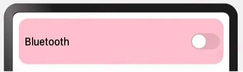
Blank 具有以下特性:
- 只在
Row和Column中生效。 - 除了
color外不支持通用属性。 - 只在
Row和Column有剩余空间才生效。 - 适合用在多设备适配场景中。
小结
本节介绍了线性容器布局里的主轴和纵轴的概念以及 Column 和 Row 的使用方法,读者可以借助线性容器组件实现简单的UI布局了,最后主要注意的是 Column 和 Row 的 space 和 justifyContent 参数不能混用。
阅读全文
下载说明:
1、本站所有资源均从互联网上收集整理而来,仅供学习交流之用,因此不包含技术服务请大家谅解!
2、本站不提供任何实质性的付费和支付资源,所有需要积分下载的资源均为网站运营赞助费用或者线下劳务费用!
3、本站所有资源仅用于学习及研究使用,您必须在下载后的24小时内删除所下载资源,切勿用于商业用途,否则由此引发的法律纠纷及连带责任本站和发布者概不承担!
4、本站站内提供的所有可下载资源,本站保证未做任何负面改动(不包含修复bug和完善功能等正面优化或二次开发),但本站不保证资源的准确性、安全性和完整性,用户下载后自行斟酌,我们以交流学习为目的,并不是所有的源码都100%无错或无bug!如有链接无法下载、失效或广告,请联系客服处理!
5、本站资源除标明原创外均来自网络整理,版权归原作者或本站特约原创作者所有,如侵犯到您的合法权益,请立即告知本站,本站将及时予与删除并致以最深的歉意!
6、如果您也有好的资源或教程,您可以投稿发布,成功分享后有站币奖励和额外收入!
7、如果您喜欢该资源,请支持官方正版资源,以得到更好的正版服务!
8、请您认真阅读上述内容,注册本站用户或下载本站资源即您同意上述内容!
原文链接:https://www.1024c.cn/archives/21217,转载请注明出处。

评论0